احصل على العديد من التصاميم لمشروعك. اختر التصميم الذي تحبه.
يقدم معماريون ومصممون حقيقيون من جميع أنحاء العالم تصاميم لمشروعك، من $250. تقدير مجاني، دون التزام.
يقيّم العملاء تصاميمهم الفائزة بـ 4.5 من 5 (890+ تقييم) إلغاء مجاني فى خلال 24 ساعة من الاطلاق! آلية العمل هل أنت مصمم؟ استكشف المسابقات →
 تنويه شرفي
تجاري · مشاركة تصميم
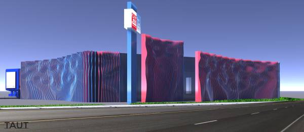
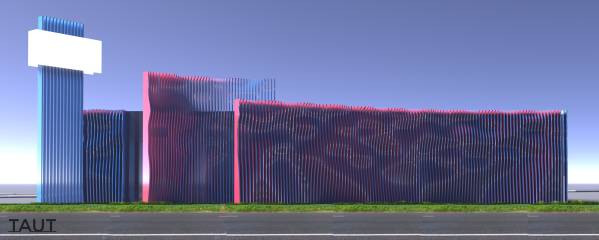
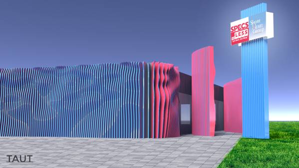
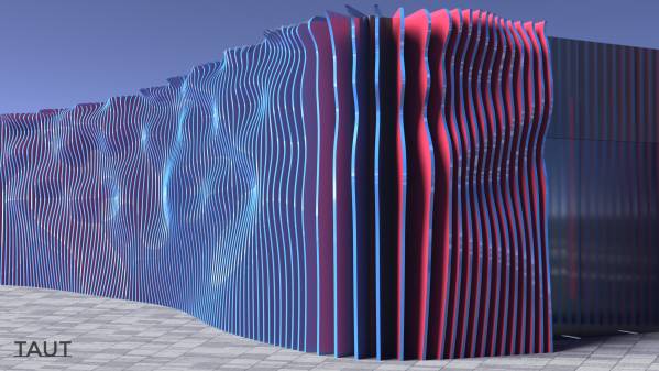
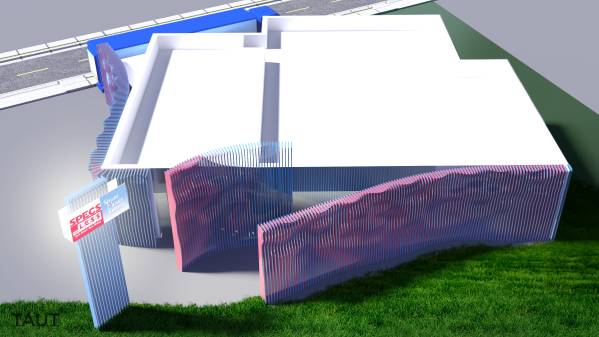
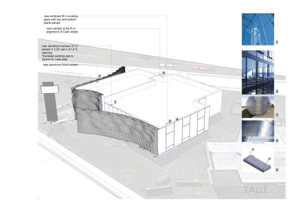
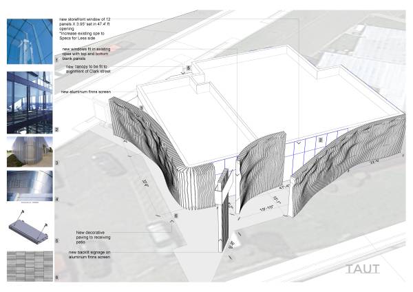
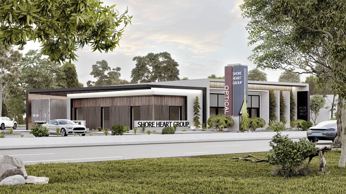
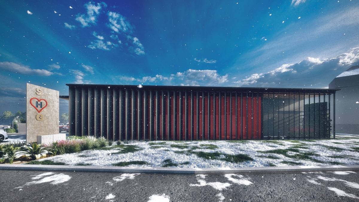
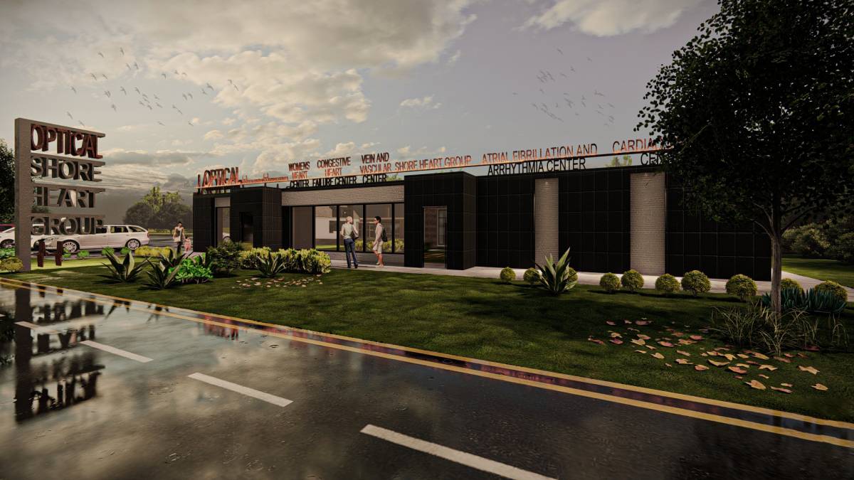
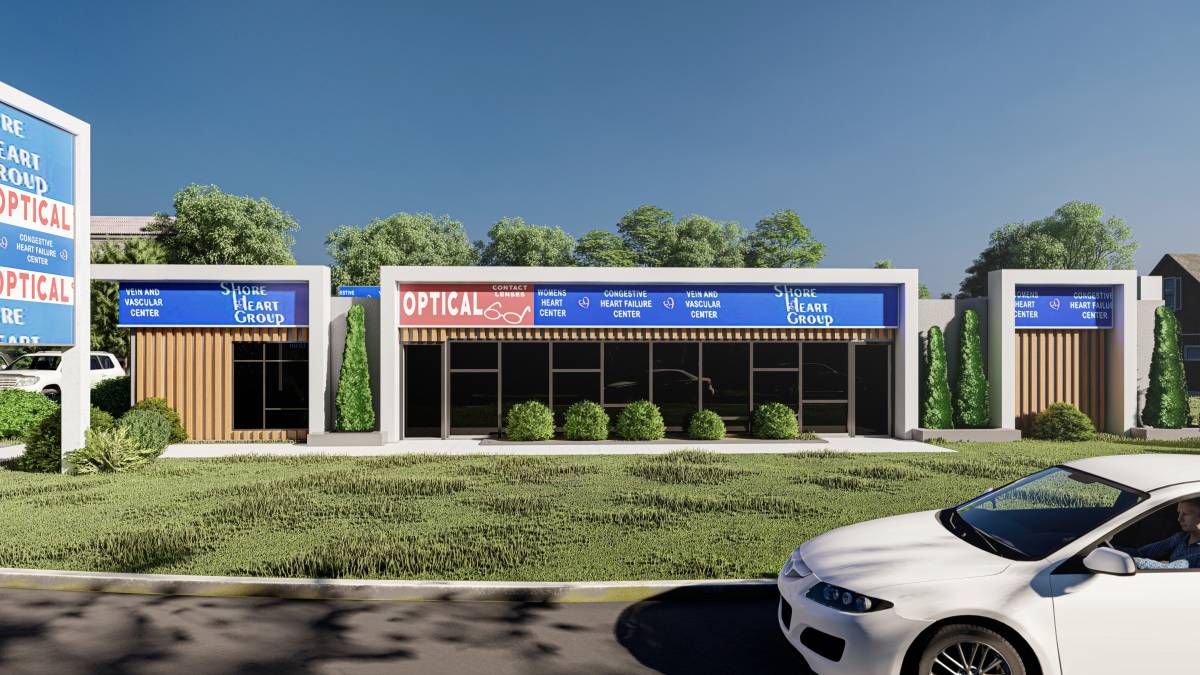
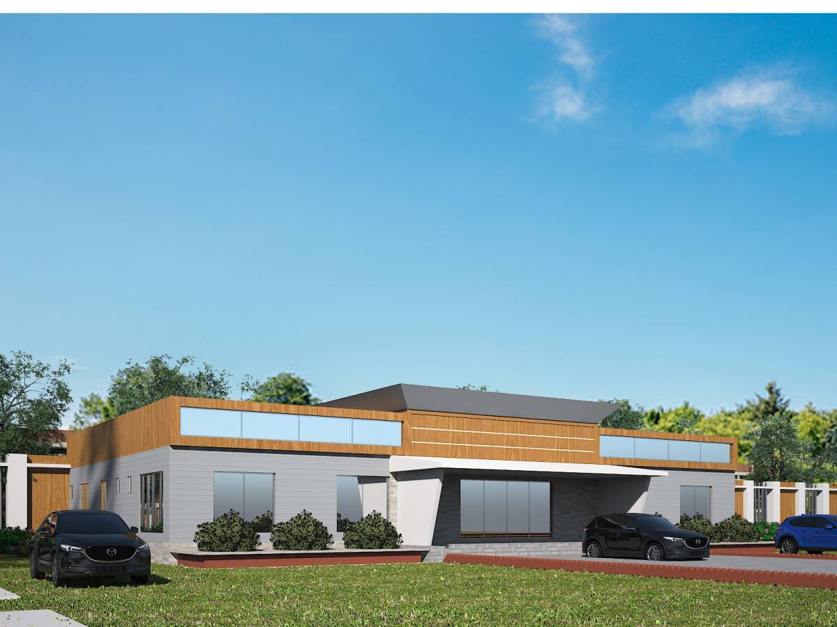
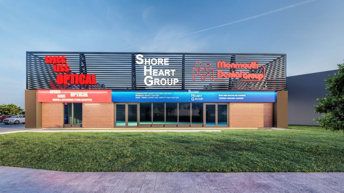
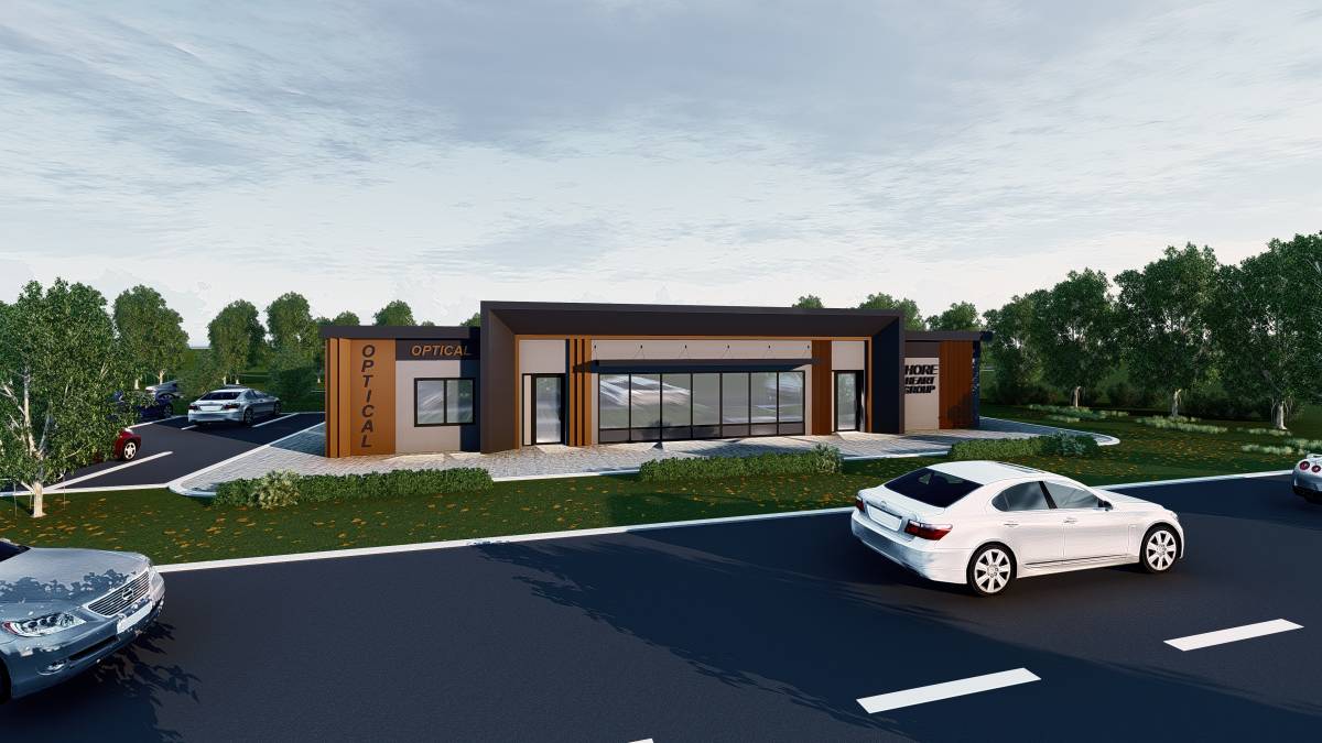
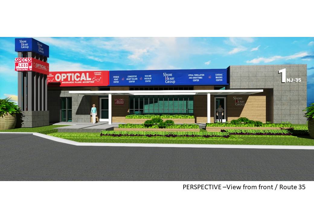
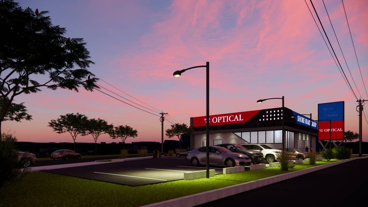
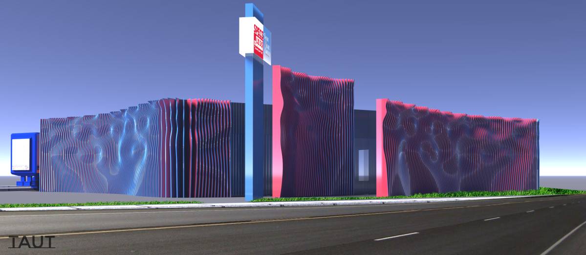
إعادة تشكيل مبنى المكاتب Keyport - 1 Highway 35 South ، Keyport New Jersey
بواسطة oana, اسبانيا
جائزة
$750
تحت المتوسط ($1,550)